Elevating Senior Living
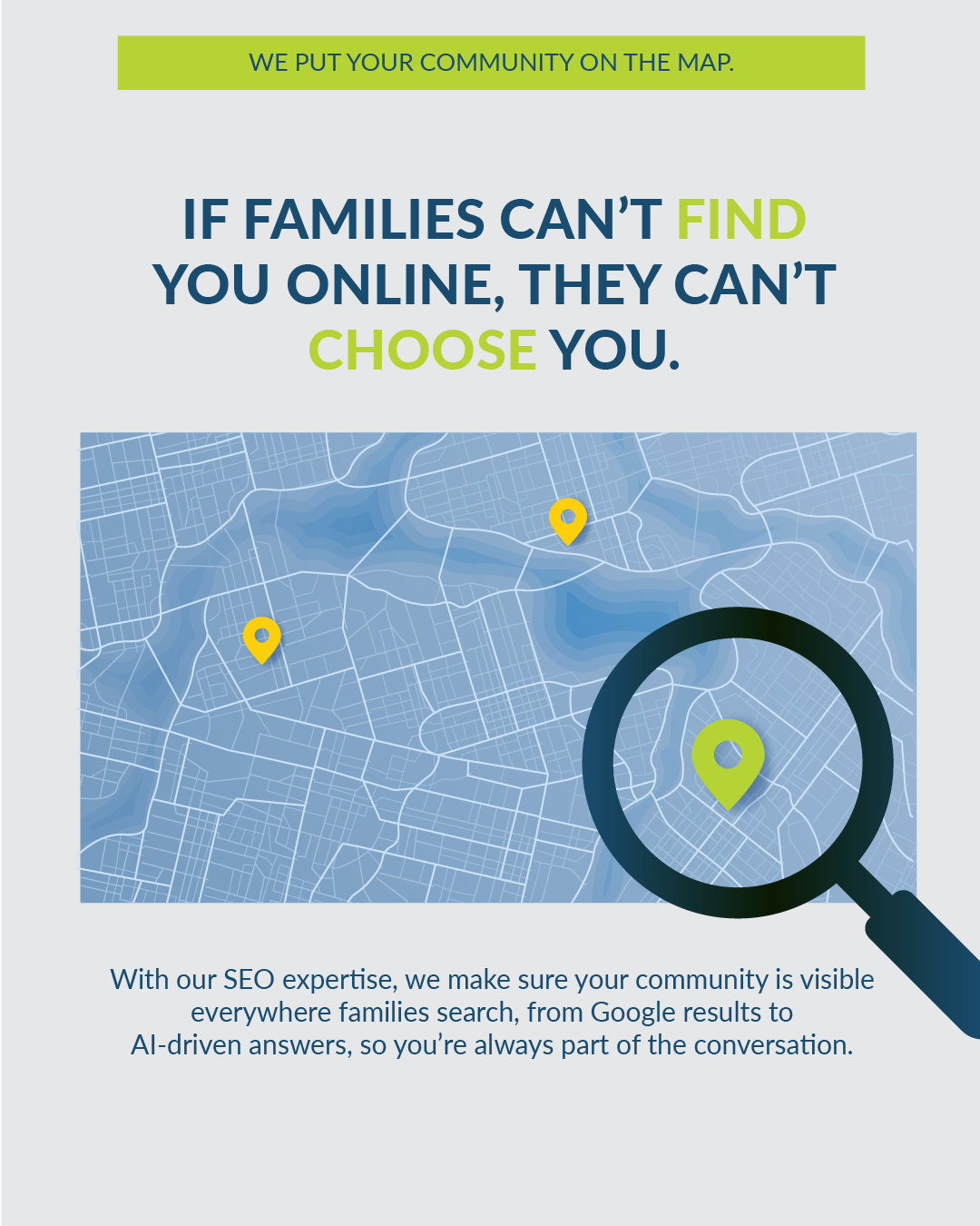
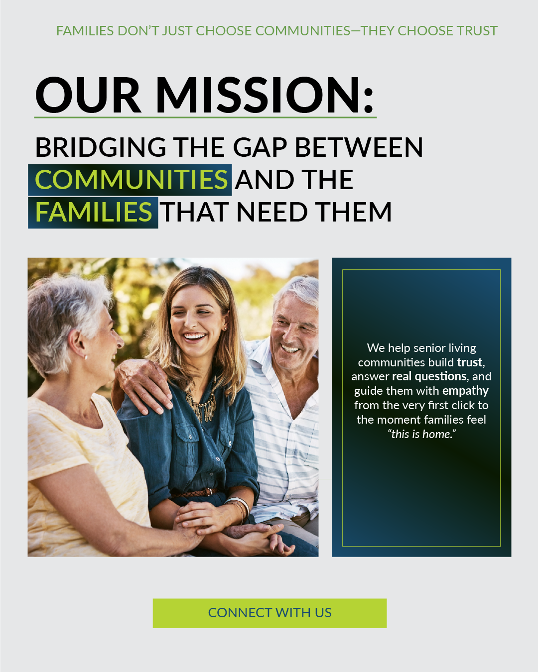
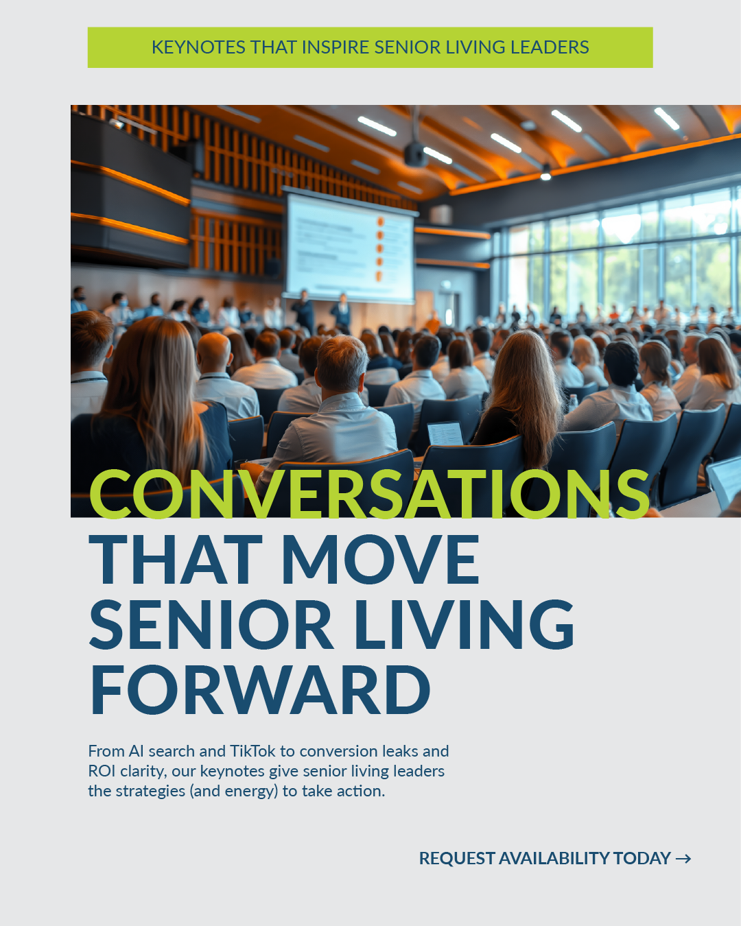
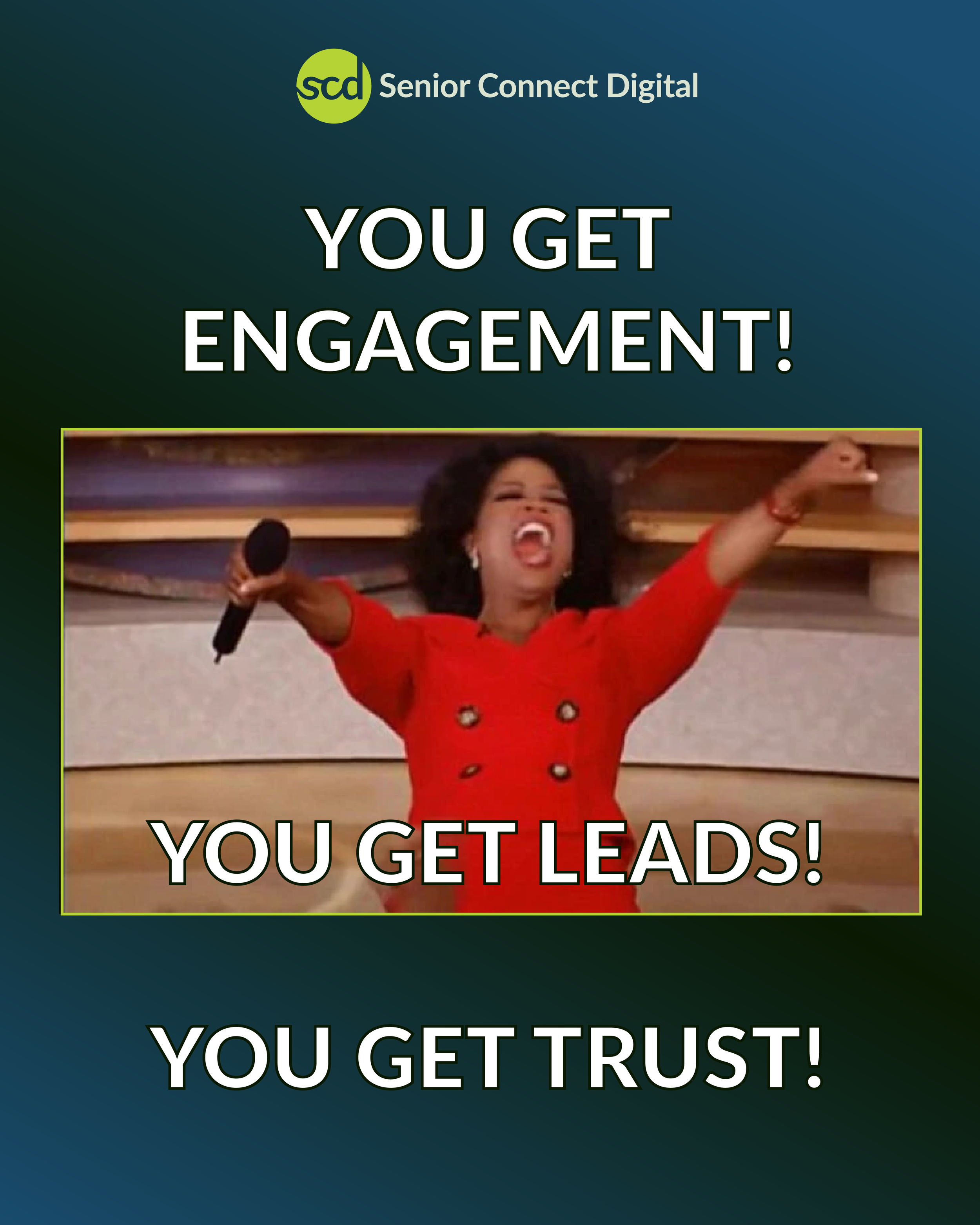
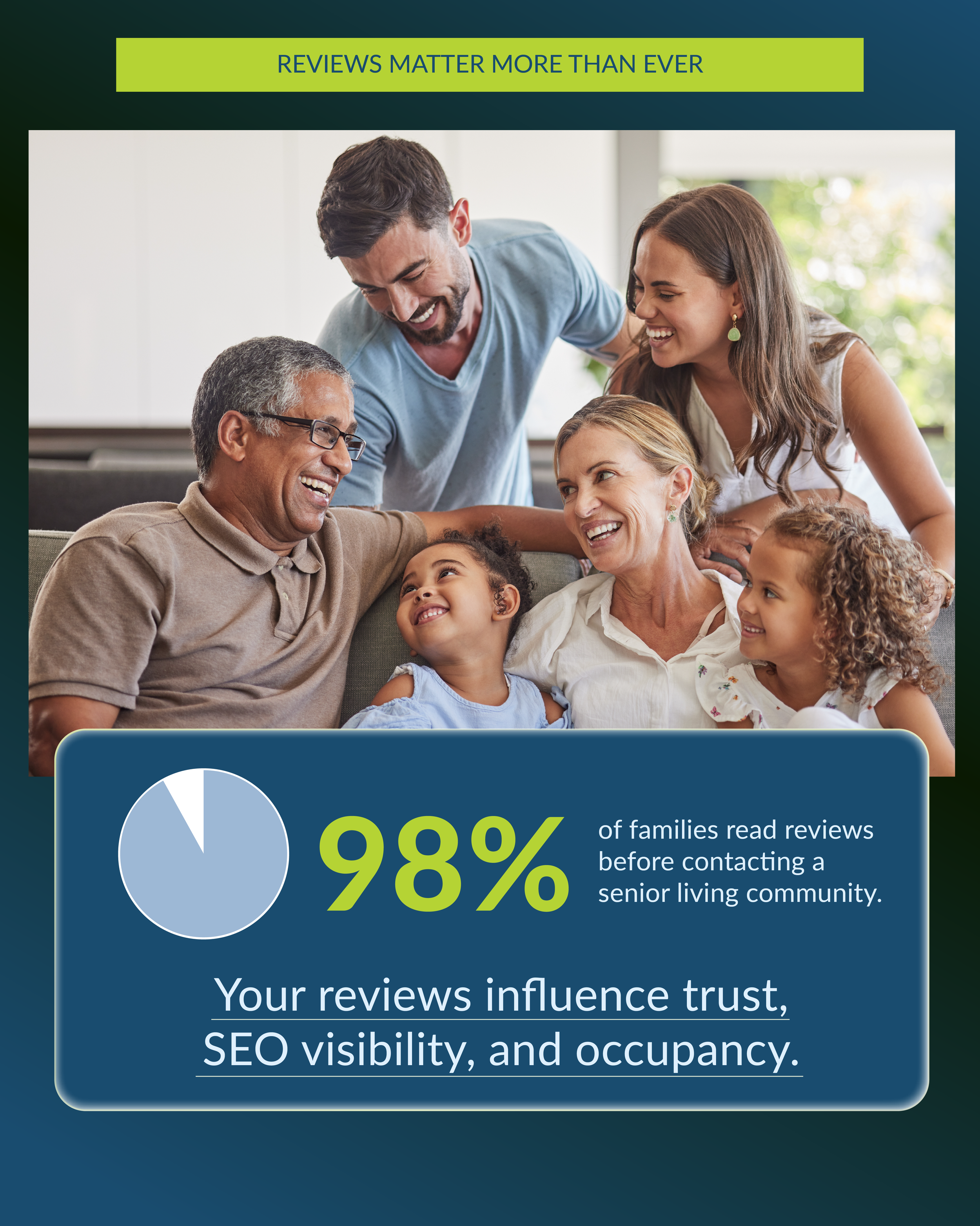
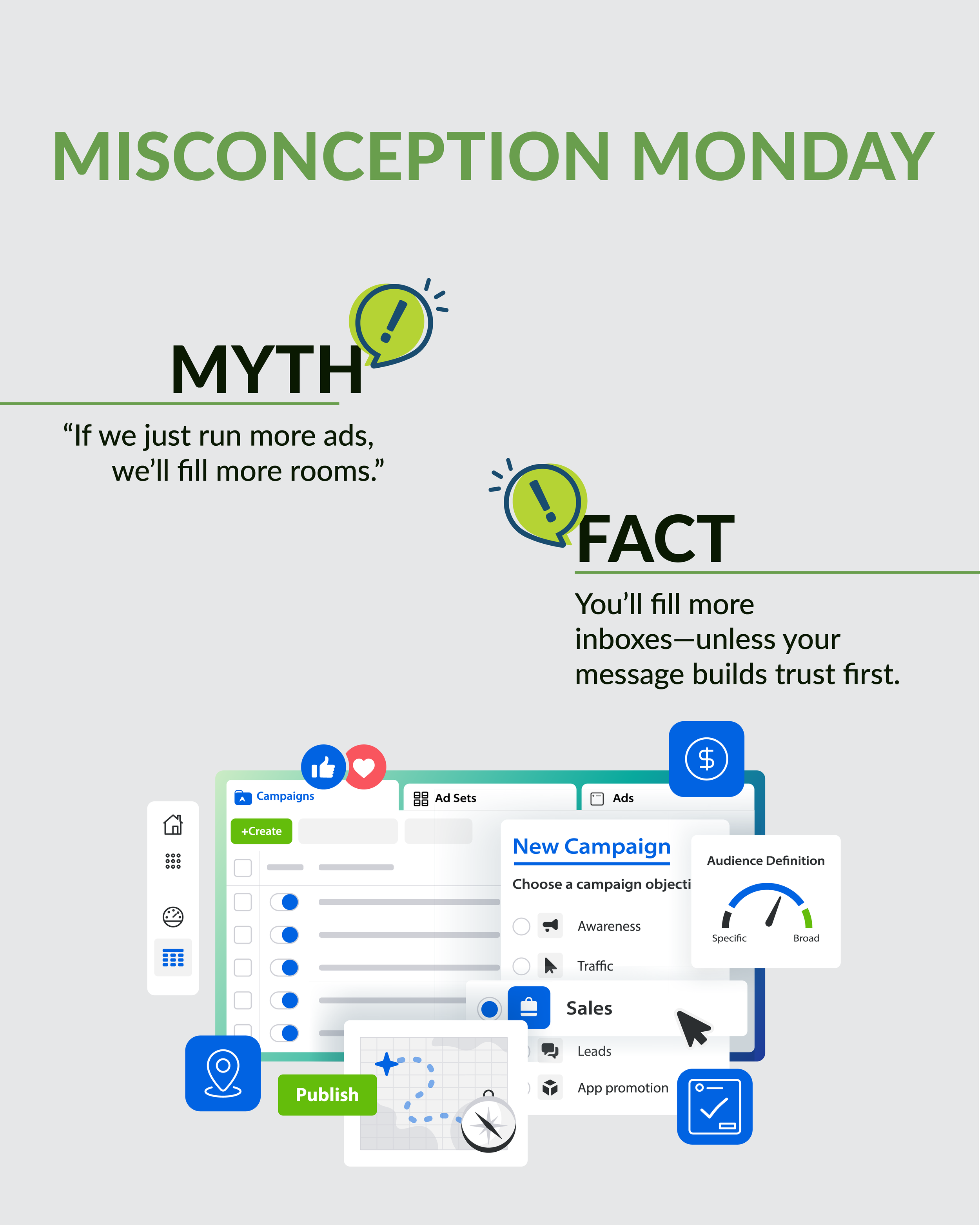
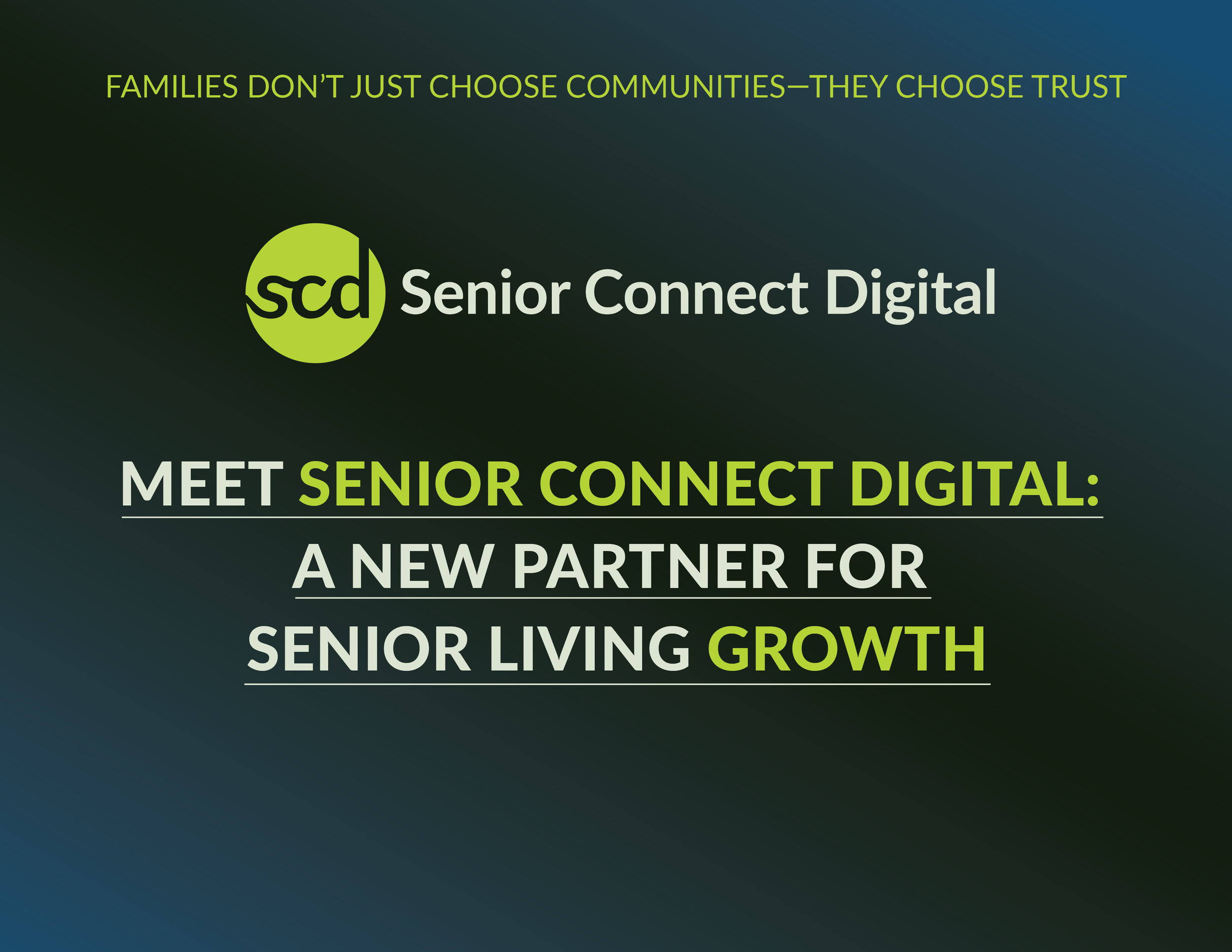
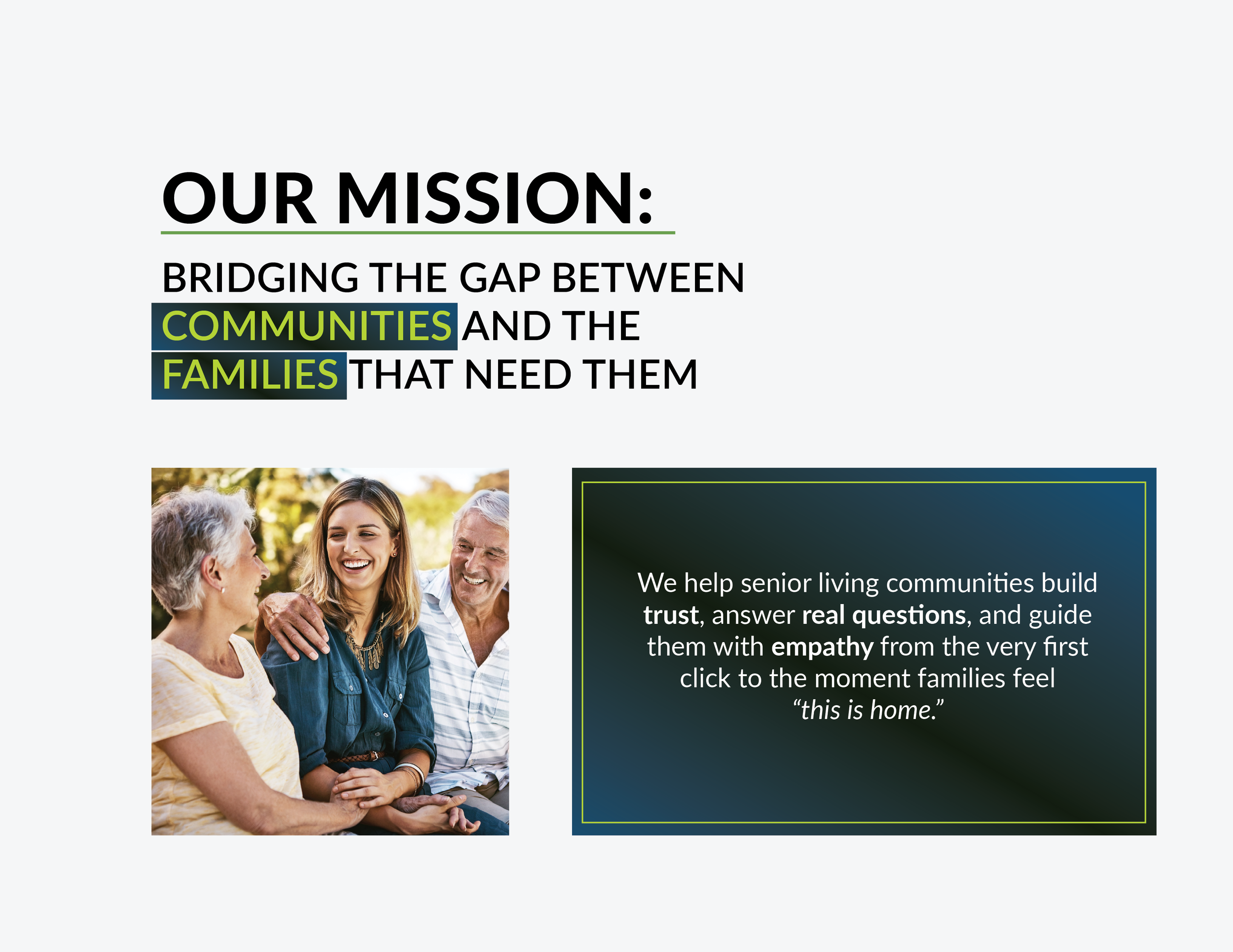
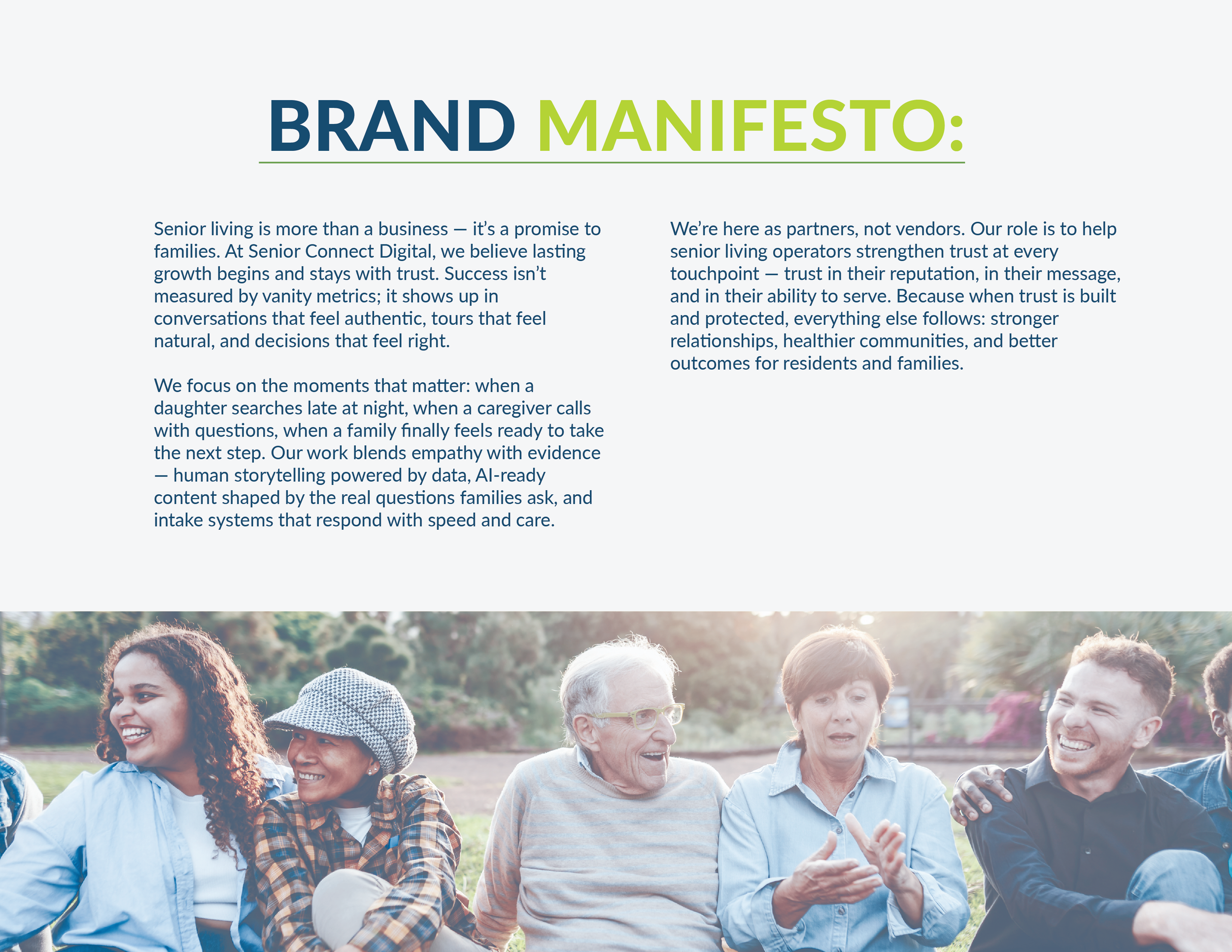
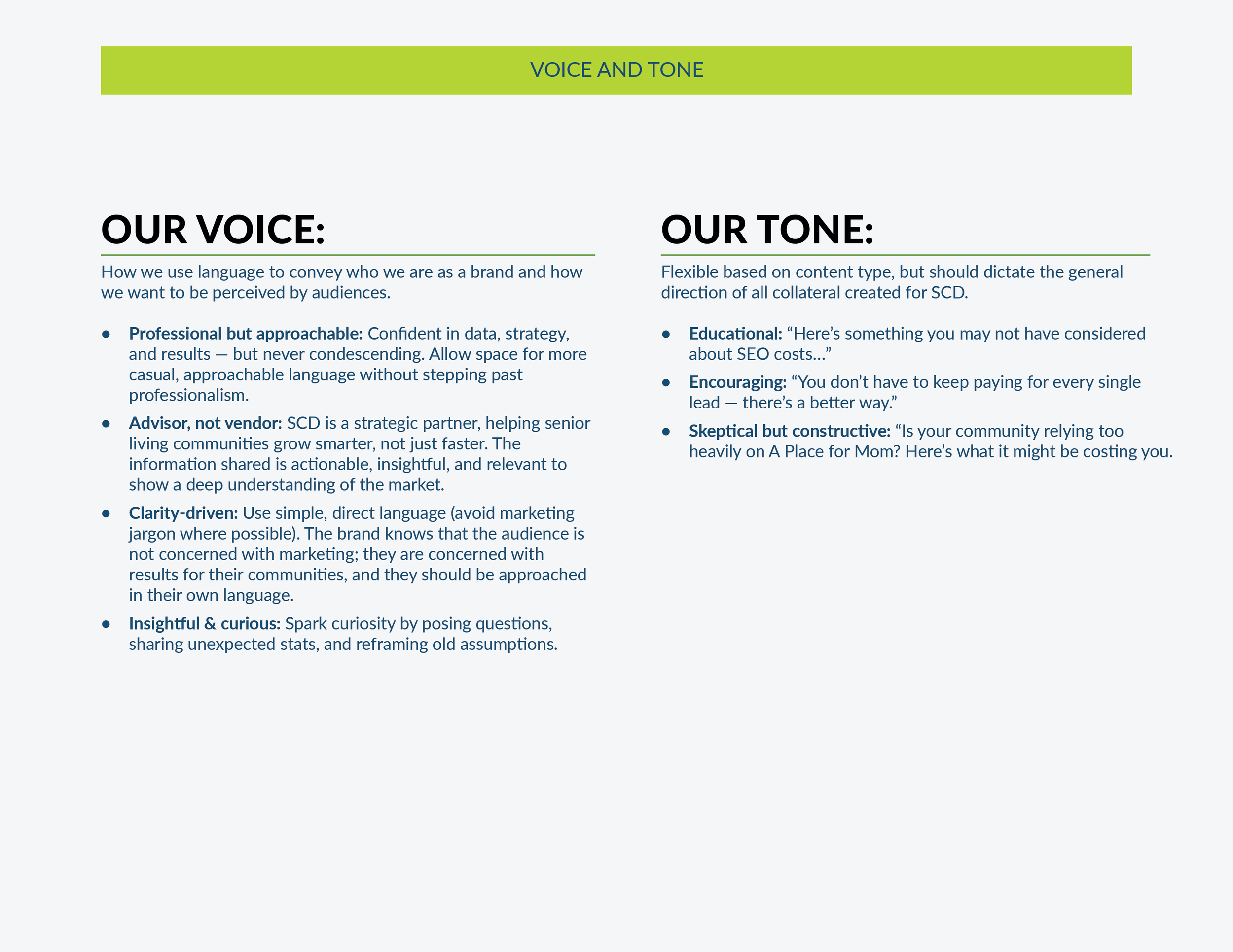
As Pantelope grew, they began to see land a certain type of client: senior living communities. In senior living, reputation and experience are everything. Instead of letting the senior living sector remain a small piece of Pantelope, the agency decided to develop a dedicated subbrand. This meant new colors, a new logo, and a dedicated website, all meant to convey a deep dedication to the senior living industry, an understanding of the nuances of this unique business, and resources to continue to build trust with community owners and leaders.
-
The marketing team gathered to determine the overall parameters of this project. Once some essentials were determined - the goal, the timeline, a list of assets needed immediately and which could be in the second wave- I kicked off the design.
-
When developing. abrand, I always hold two things in mind, what is the company’s goal and who are thy trying to connect iwth. In this case, the brand needed. tomove fast but the deliverables needed to be polished and perfected, as conveying reliability was of the utmost importance. With this in mind, I reviewed competitors to gain an understanding of the industry trends, find weaknesses in those brands, and identify ways to stand out.
-
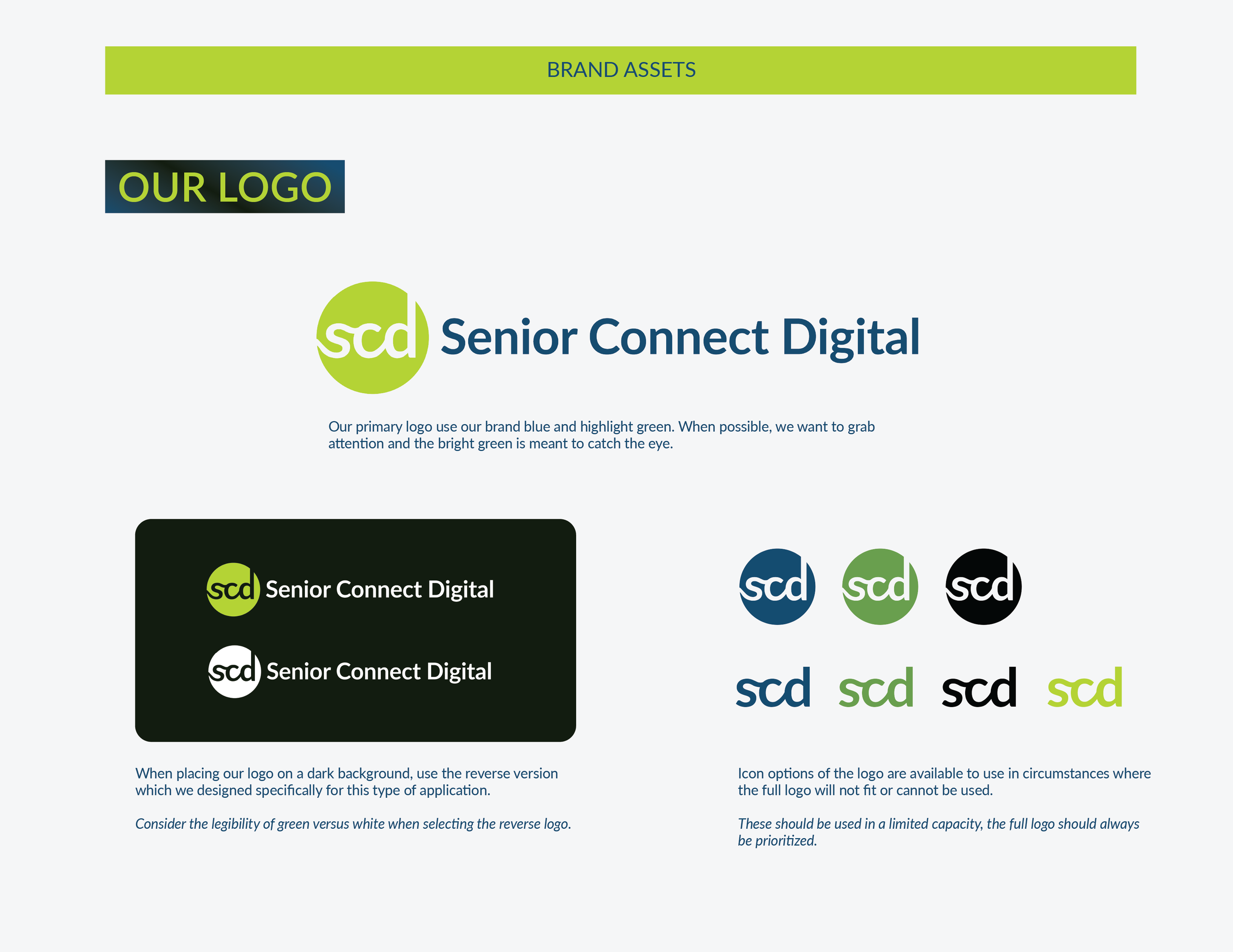
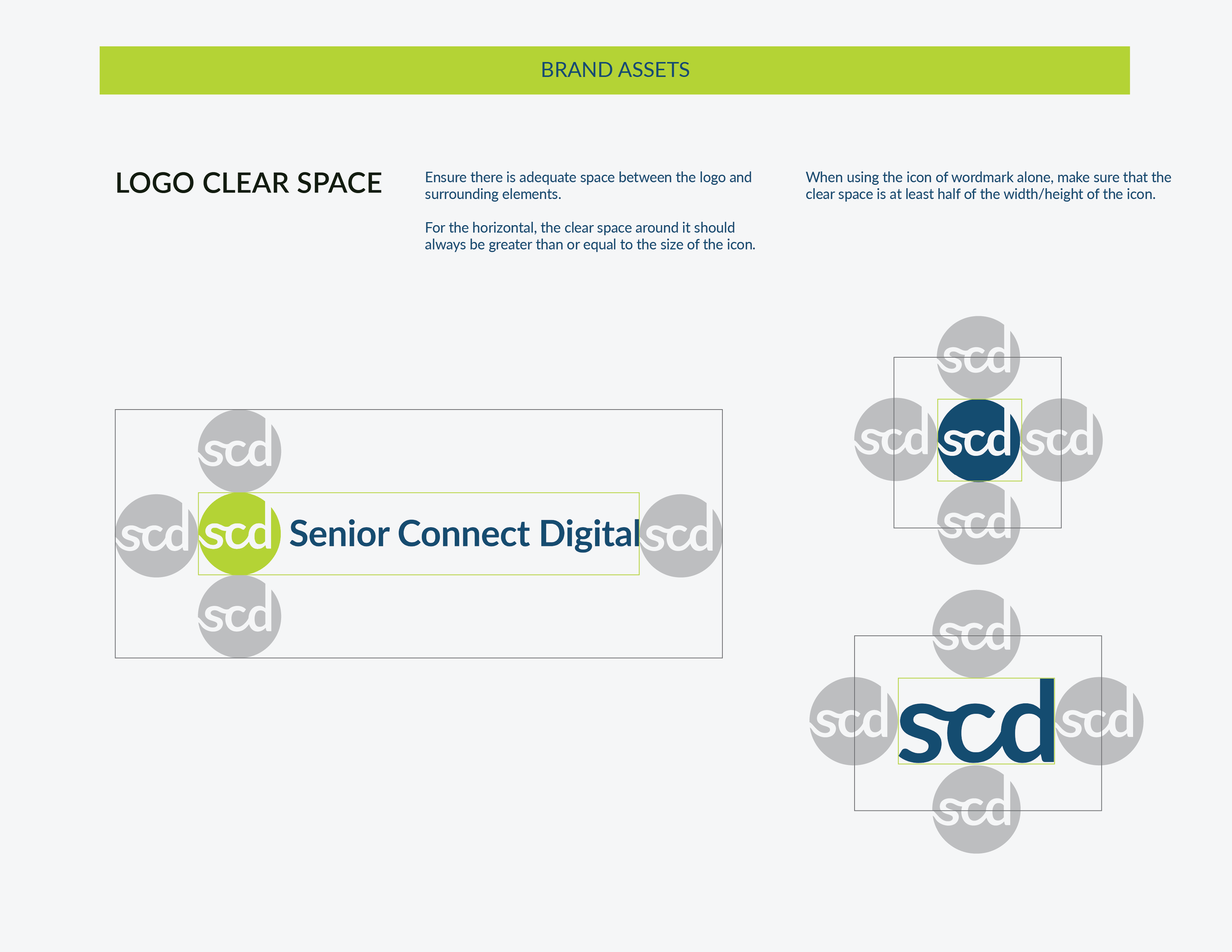
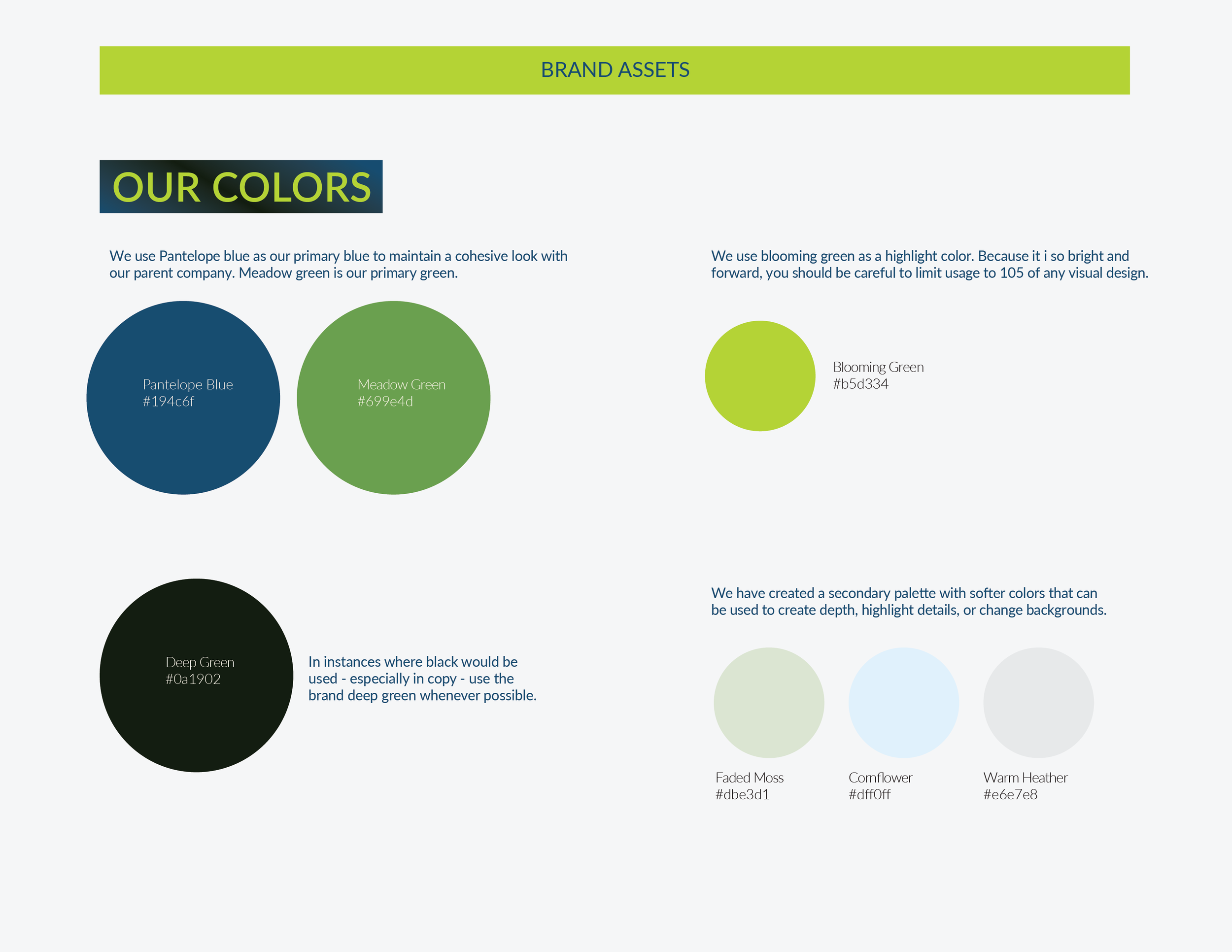
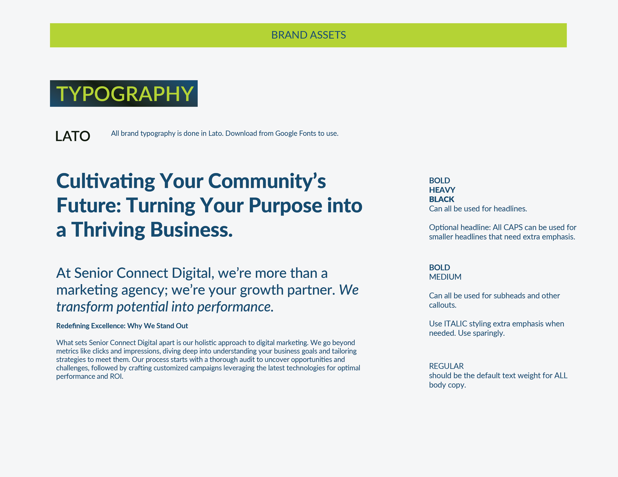
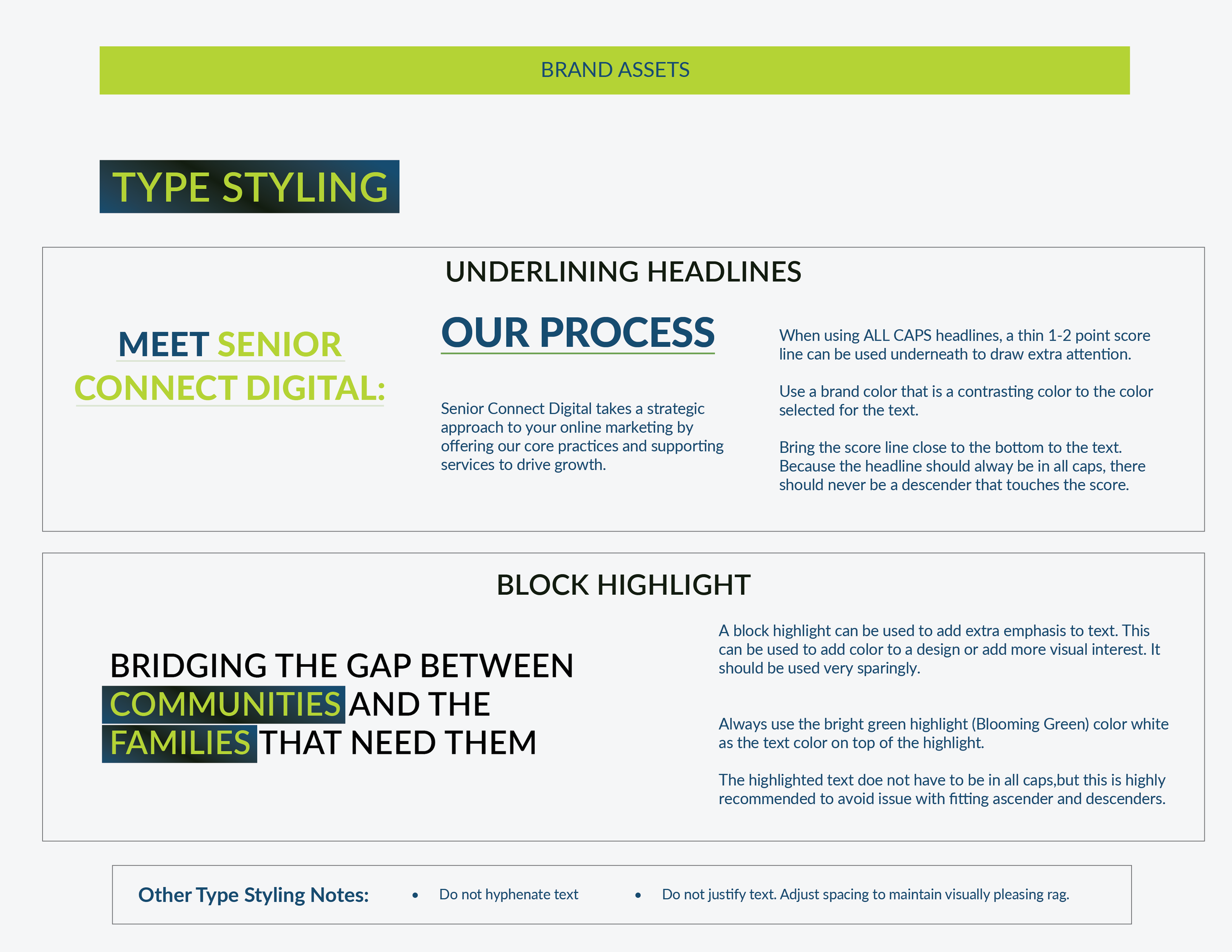
When it came to making my choices, the timeline demanded I make them quickly. I found blue and yellow and the occasional purple to be the dominate colors. To make sure this brand stood out from the parent brand, I knew yellow was out. Instead, I chose a green to convey prosperity, growth, and liveliness. Most logos were abstract, and so I chose to use a lettermark with bold lines. From these initial decisions, the rest of the brand that you see below was created.


The design process for this brand moved quickly in these three basic steps:
01
Scope and Goal
Alignment
02
Competitor Research
and Analysis
03
Visual Development
Brand Iconography