Institute of Culinary Education
Countdown Campaign
About the ClientThe world’s preeminent culinary authority and training ground for the next generation of Michelin-star chefs.
❋ The ChallengeThe Institute of Culinary Education (ICE) is a higher education culinary school that operates in a highly competitive online advertising space. Competitors have large advertising budgets and extensive ad libraries.
Over the course of several months, our team identified a leads issue - ICE was not getting the results they needed. I stepped in to brainstorm creative solutions that could turn results around.
❋ The ObjectiveDevelop new creative solutions to drive leads and stand out in a competitive online market.
Adhere to strict brand guidelines and maintain careful stewardship of the ICE brand.
❋ The HypothesisBecause ICE has multiple start dates for each program during the year, potential students feel no sense of urgency to register, even if they are interested, leading to low leads. The client’s goal was to generate 100 new qualified leads.
By creating ads that emphasize upcoming deadlines, I hypothesized that we could generate more leads because the potential students would feel a greater sense of urgency and would choose to act faster.
❋ The ProcessMeet with the account manager to discuss the design challenge and set a project timeline. Research past ads and current competitors.
Brainstorm any initial ideas. I believe this step should be exploratory; all ideas should be explored and evaluated. From these initial ideas, I develop more detailed concepts that will be reviewed with the rest of the team.
Review the brainstormed concepts internally, discuss designs, refine concepts, and prepare to present the concepts to the client.
Present the new ad concept to the client, making sure to describe my thought process and hypothesis. Gather any feedback from the client and address any concerns they have.
Make any edits requested by the client and present for final approval. This may take more than one round. Once approved, the ad must be created in all aspect ratios for their platform.

Top-performing legacy ad
(created by previous agency)

Top-performing Pantelope ad
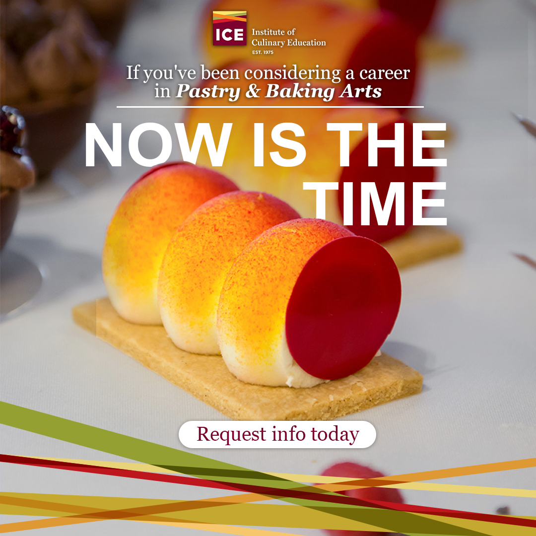
Top-performing Pantelope ad
EVOLUTION OF THE COUNTDOWNSResearch and Inspiration
When developing the countdown concept, I used the client’s Ad Manager to review previous ads and chose the most successful ones to reference. From those, I identified patterns and elements I thought contributed to their success, such as:
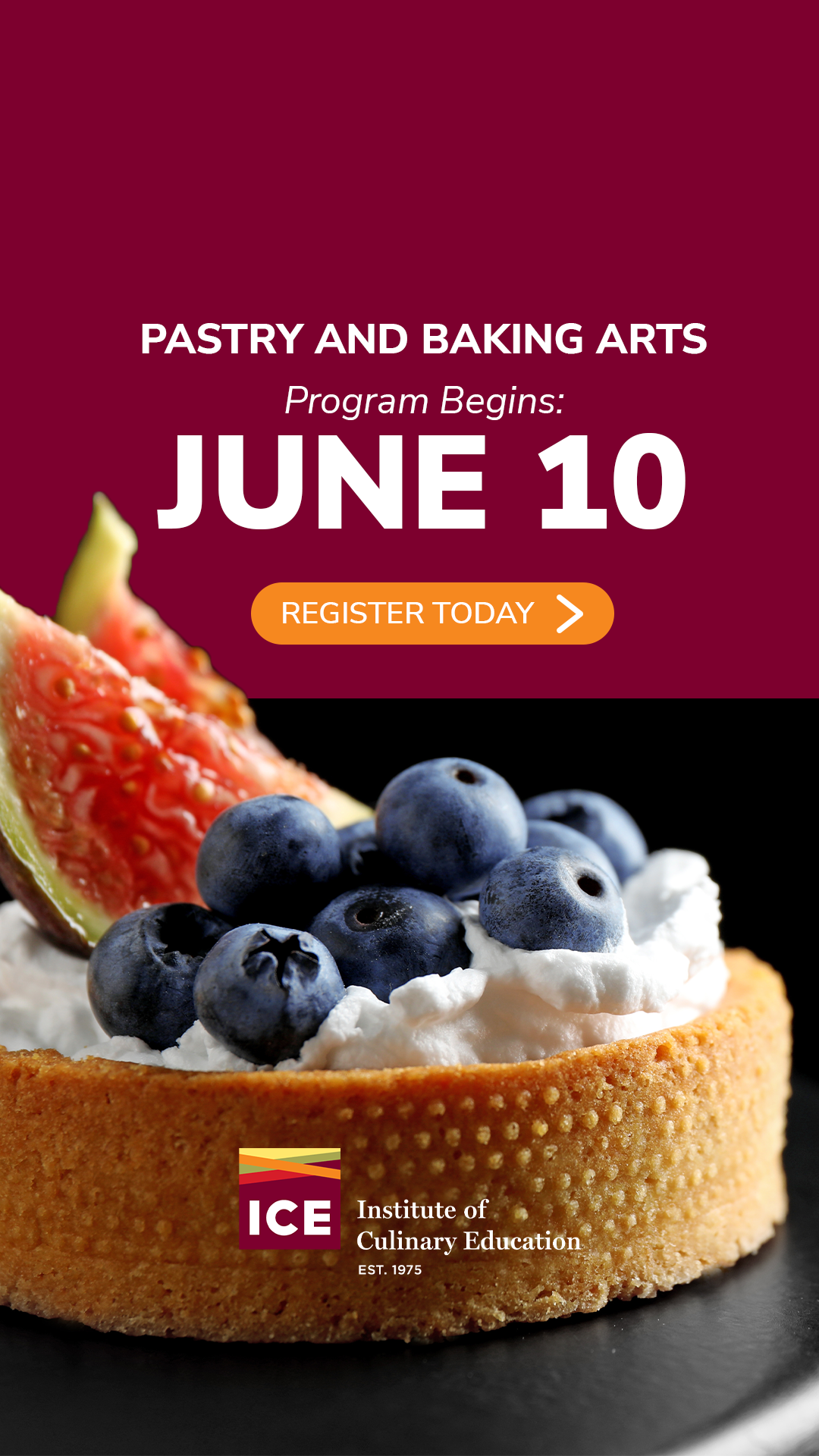
Layered images and graphic elementsBright, appealing photos featuring completed dishesPreference towards photos that have a color palate close to the brand colorsSimple text and bold headlines


Concept Drafts
Selected Concept
EVOLUTION OF THE COUNTDOWNSBrainstorming and Concepting:
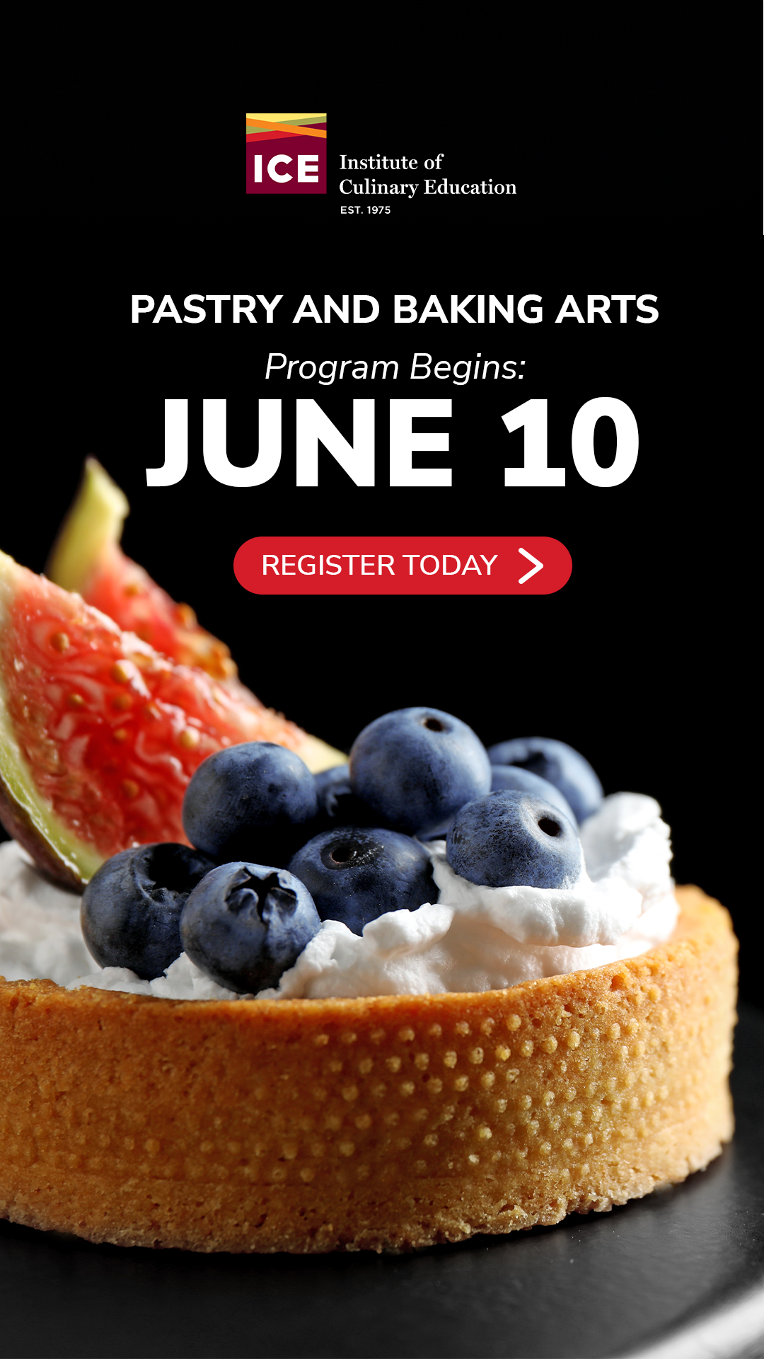
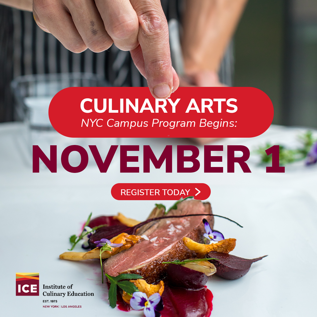
When developing concepts, I kept in mind the strong design elements I had identified in my research and selected the key pieces of information that needed to be displayed in the ad. Because my hypothesis centered around time-based urgency, I determined that the class start date should be the headline, supported by secondary text showing the name of the course and its campus.
EVOLUTION OF THE COUNTDOWNSFinal Assets

As part of the process I developed at Pantelope, approved assets must be recreated in all aspect ratios needed for the platform they are being used on before the project can be considered complete. At the time this project was completed, the final aspect ratios for META included:
1x1 (1080x1080 pixels)
9x16 (1080x1920 pixels)
16x9 (1920x1080 pixels)


KEY RESULTS
As our team has run the variations of this design, each version consistently performs well. Our current strategy, as discussed between me, the account manager, and the client, is to continue with this style of ad, experiment with photos to continue our search for data on how audiences respond to images, and use those findings in other campaigns.
After running for nearly two years straight, this campaign has been one of the most successful ever.
Data Source: FB Ads Manager-
Over the lifetime of. the countdown campaign, the ads have collectively pulled over 7,000 qualified leads into the top of the sales funnel.
-
This number has fluctuated as we continue to cycle through ads. Some new images perform better than others, and some programs have increased or decreased in general popularity, but this benchmark has remained consistent.
-
Over the lifetime of this campaign (2024- present), the leads have averaged $57. There are outliers, but the most common CPL we see comes in comfortably between $30 and $90.
EVOLUTION OF THE COUNTDOWNSUpdates and Fighting Fatigue
The campaign doesn’t stop at those first designs. Anything that you want to continue with this level of success fights a constant battle against creative fatigue. In other analytics, I have identified that this particular client has a 2-3-month fatigue cycle. Since these ads are removed every time the class start date passes, we have an excellent opportunity to continually refresh the designs. See below to view the way these assets have evolved and continue to evolve.
First Gen
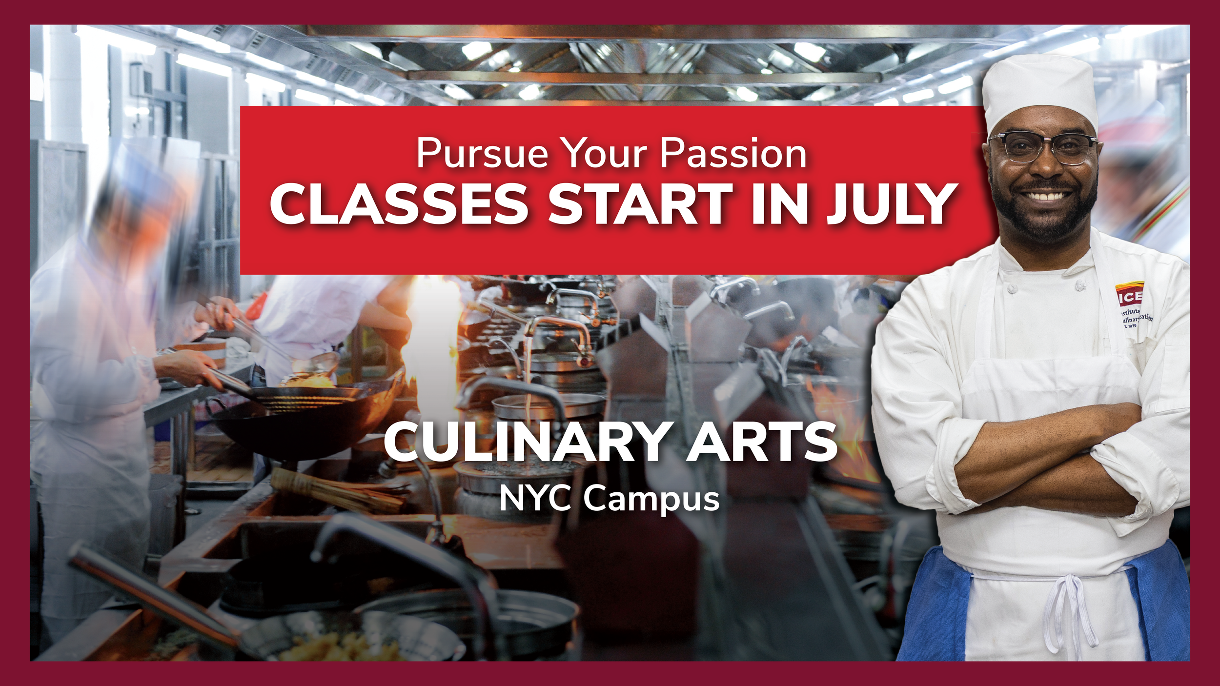
Design is food-focused, featuring finished, plated dishes




Second Gen
Incorporated darker backgrounds to test audience response. Begin to include hands in action, in addition to plated dishes.


Third Gen
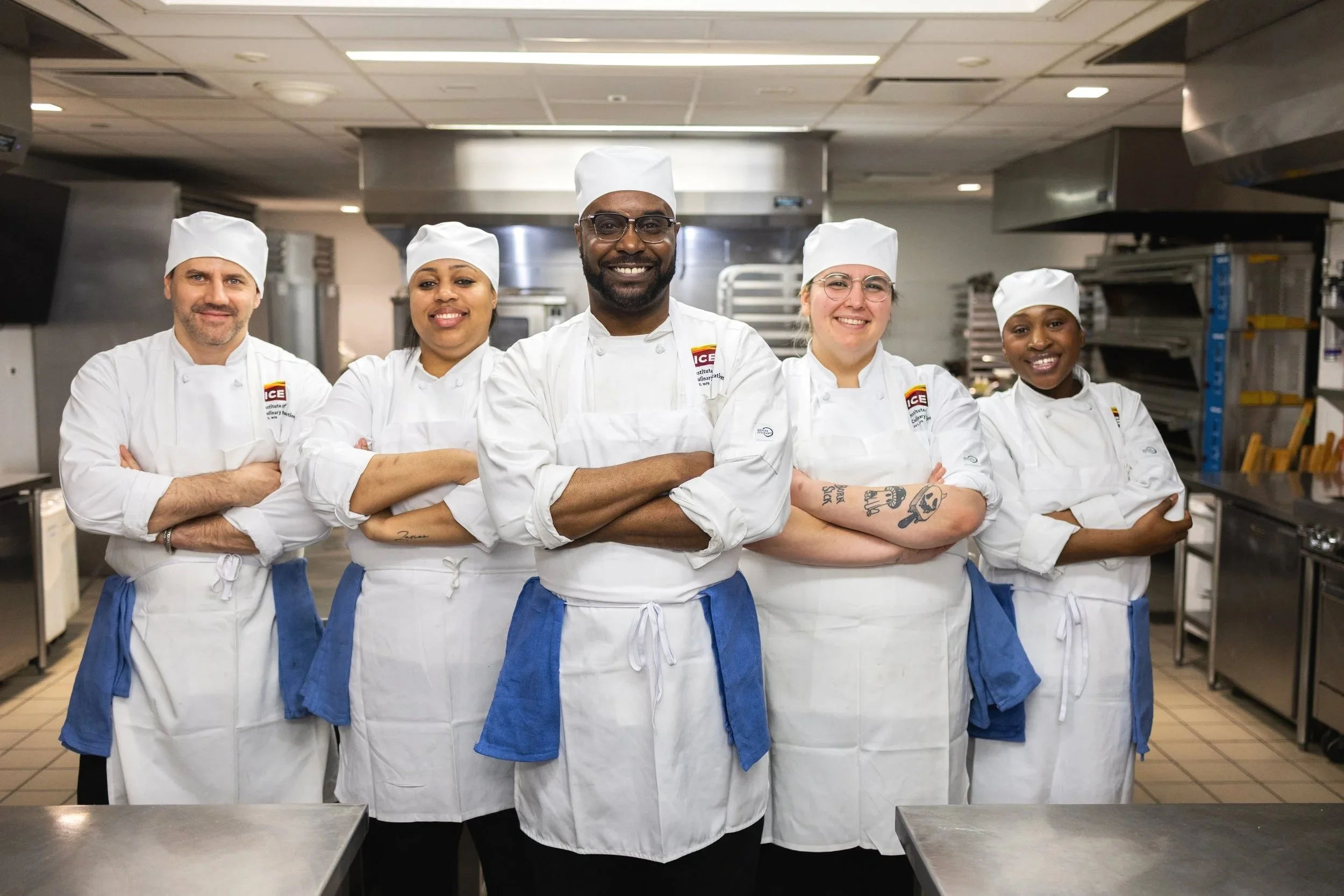
Added students working on dishes. Landing page testing produced great results with student images, and based on this feedback,
I decided to bring similar images into ad testing to see if we could generate matching results



Fourth Gen
With the increase in class start dates, we reevaluated whether every single start date needed an asset or if monthly countdown ads
that stated the category was beginning soon would work. These are being tested currently with good results so far. We will know conclusively
if this new format is successful in the next several months.